5 Key Elements for Creating Zones in an Open Plan Space
There are many reasons why an open floor plan layout is desirable. Better connection with guests, an airy, more pleasant atmosphere, and ease of entertaining are top of mind. But the open plan space can also present some design challenges. Without the seasoned eye of a creative interior designer, it can be difficult to zone your spaces in a way that makes sense with traffic flow, scale and size.
The goal should be to create segmented, intimate areas that allow for ease of navigation through and around each zone. Minimize noise through design elements that insulate, add warmth and muffle sound. Create an ambience that draws in guests and encourages engagement, connectivity and communication.
Rugs are a foundational design element that can visually break up a space, help frame your zones, and add warmth, intimacy and welcome. Learn how to use rugs in your open plan space by considering these five key elements.
RELATED: Should I Hire a Professional Interior Designer?
Carve Out the Floor Plan
Firstly, determine what spaces you’d like to separate and what purpose the rooms will serve. The most common way rugs are used to create zones is to differentiate between living spaces and dining rooms, as well as highlighting a foyer or hallway. Consider your open plan as a large photo frame, and box or section off areas for the purpose you’d like each area to feature. Allow the space between rugs to create a natural separation between “rooms,” keeping the overall look clean and unbusy.
EXPERT TIP: Remember that too many rugs can make a space look cluttered, so it’s best to have a well thought out game plan before outfitting your space.

Consider Materials & Pile Height
How do you know what type of rug material to choose?
Begin by considering purpose and placement. Is it a high-traffic space?
Going with a robust wool material ensures that the carpet will withstand wear. Another heavily traversed zone is hallways, where the use of a runner helps soften and define traffic flow. An even pile height is ideal here as well so that the rug is not a trip hazard.
If you’re planning for a space beneath chairs that will be moved, such as a dining area, an even pile height is an important consideration to ensure the chairs aren’t wobbly. In contrast, a fixed sitting area would be a perfect zone to introduce more texture and fabric variety through a mixed pile height or a silk-wool blend.
For a list of all rug fabrics and blends, explore the materials used in Tufenkian hand-selected rugs.
RELATED: What’s the Best Rug Material for My Home?
Coordinate Rugs
In order to maintain a cohesive look, a great rule of thumb is to coordinate rugs.
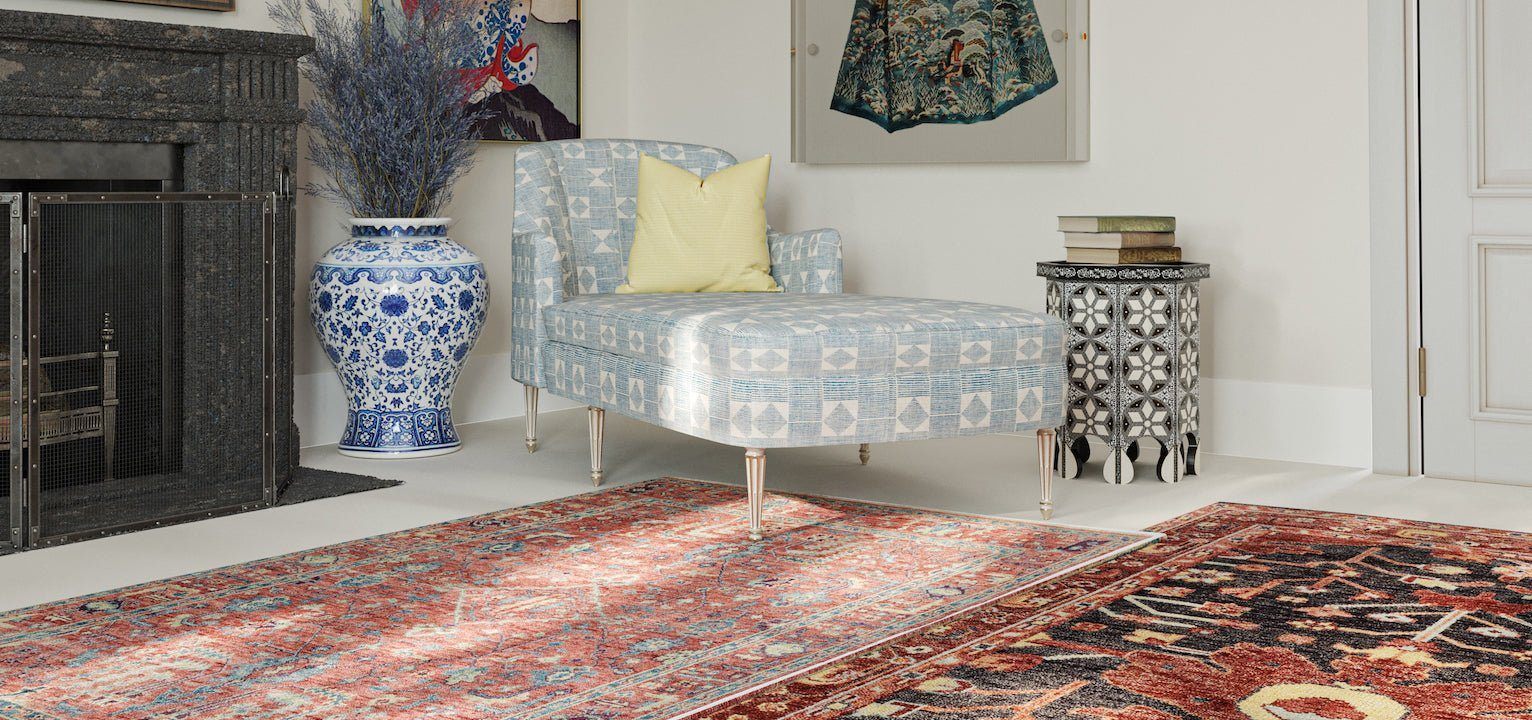
If you’d like to introduce a bold, striking pattern in your living room, for instance, Tufenkian design experts suggest pulling something more subtle in a matching colorway into the dining room or hallway.
Too many busy patterns compete with one another, distract the eye and create chaos rather than calm. Match tones and hues to maintain a subtle complementary look that doesn’t compete for the viewer’s attention.
EXPERT TIP: Two rugs in one space or zone shouldn’t be competing; let one stand out while another is more subtle.
Consider Size, Scale and Furniture Placement
The biggest mistake homeowners often make when purchasing a rug is selecting too small of a size. Instead of opening up a space and enlarging it, this misstep makes a space look much smaller than it actually is. To ensure you avoid this, consider furniture placement as a means to determine rug size.
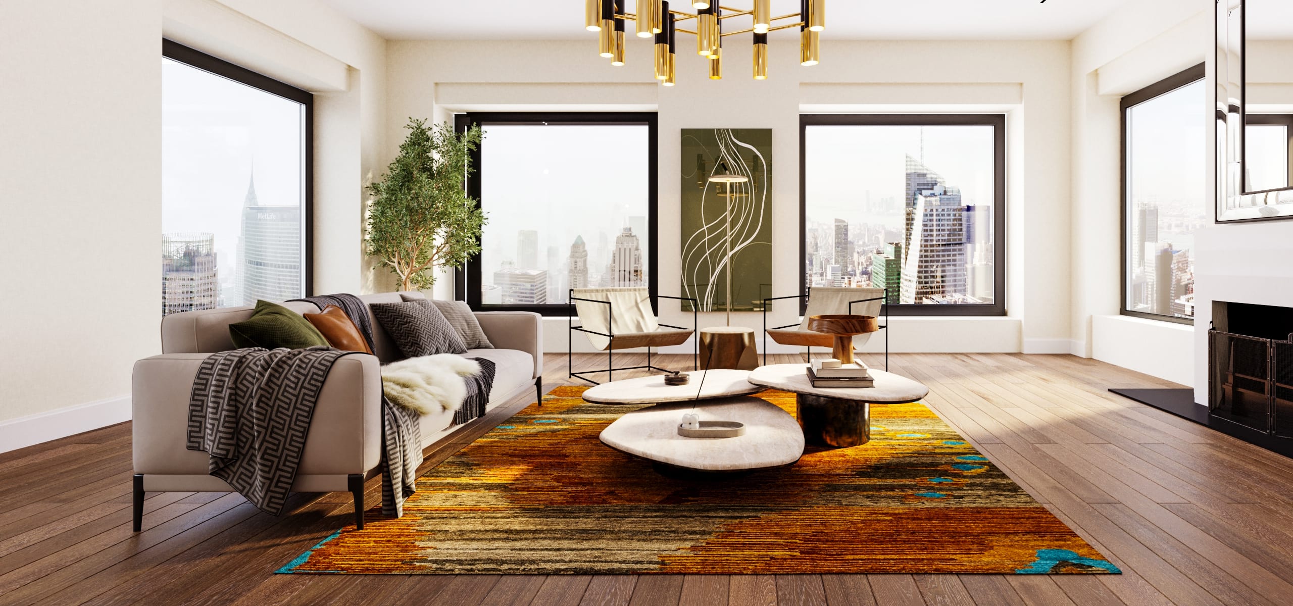
For example, in a living room where your elements include a sofa and two chairs, make sure the front legs of the chairs and the sofa sit on the rug. Place your furniture first, then measure the space to ensure there’s enough overlap for the rug to sit neatly under the furniture.

Another design tip to prevent selecting a rug that is too small is furniture grouping. When adjusting your design layout, your goal should be to show a dedicated area without sectioning it off too harshly from the rest of the room. You can do this by adjusting space between furniture elements and by opening up angles of placement.
Leave Blank Space
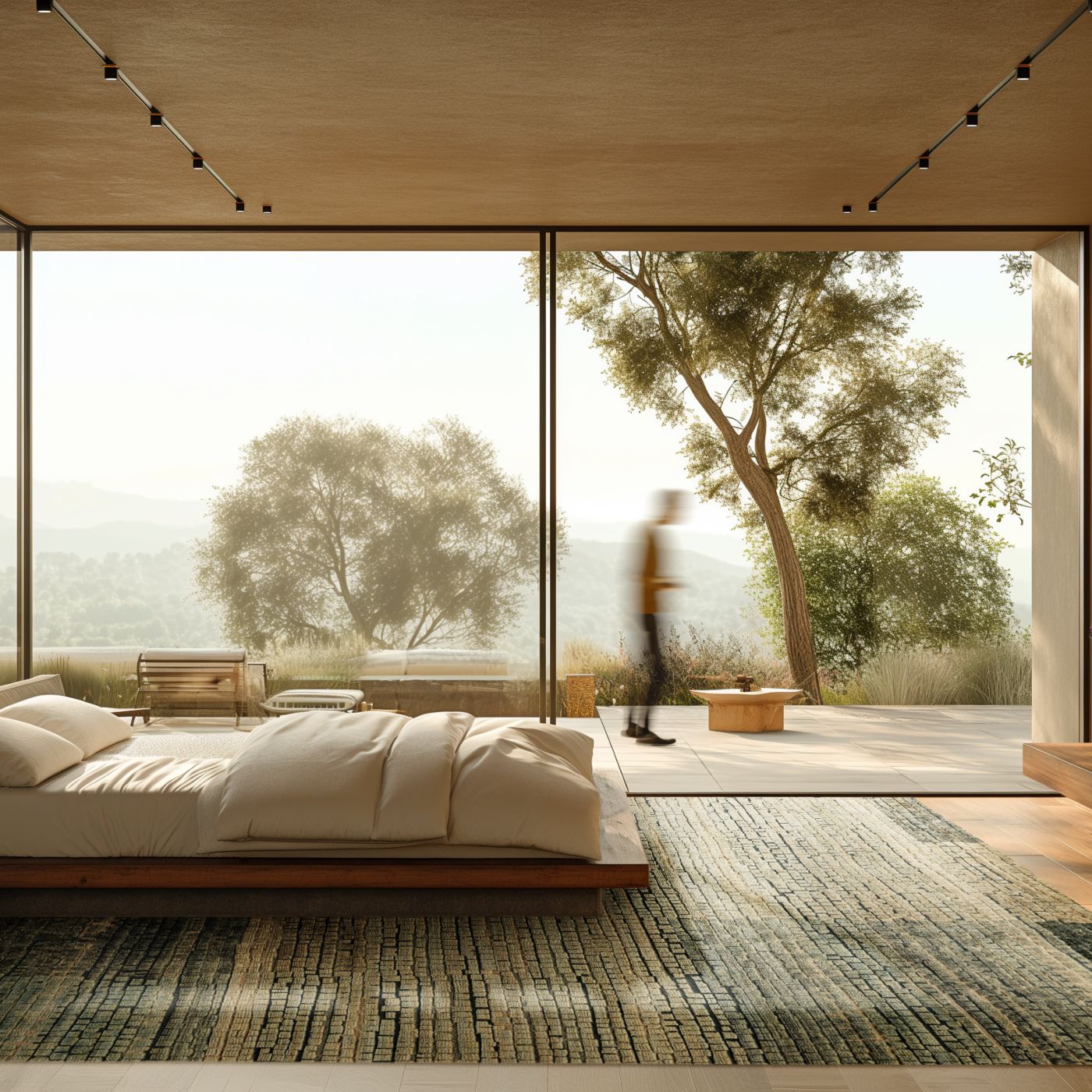
Blank space is equally as important as the design elements themselves. Just like a well laid-out website or book, blank space helps create clear delineation between segmented areas and their components. This helps to visually break up each “room”, allowing the eye to make sense of what it is taking in, preventing chaos or overwhelm.
UP NEXT: What Tufenkian Carpet (sizes, colors) Complement My Rug?


